A bit of context
As a UX-UI designer in Smartcommerce company, I was asked to enhance the design one of our products. Shopper's Choice is a code that allows a brand to increase its rate of sells, by sending products to a user shopping cart in one click.
A word about the actual product
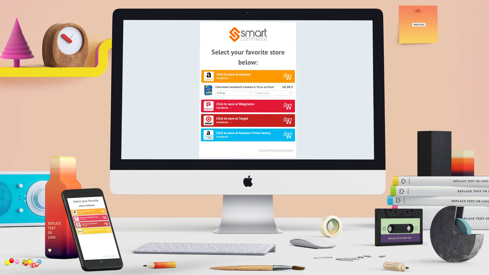
The Shopper’s Choice is a digital product that offers our customers, via three kinds of UI options, to create a more beautiful, branded, and intuitive experience for their online shoppers. The last version we released, is also used by our clients as custom landing pages for their marketing campaigns.
When a brand creates a campaign with our tool, they lead their users to our widget interface, where their customers can see the brand’s product offers. After selecting the retailer and product(s) of their choice, users are redirected to the retailer’s website - as a shortcut to enter in the carting process.
Research & empathize
Setting the scope
The Kick-off meeting
This meeting objective was to ease the communication between the different departments, understand the nature of the project, its origin, set our target user and communicate the business objectives, so the team could be aligned on all the layers of this project.
We decided to set the following OKRs as main direction for the process:
The Objectives
- On the brand side: Engage more brand to use this product as an alternative to a landing page.
- On the user side: Increase the convertion rate of the UI.
The Key Results
- Create more connection between the brand and the widget.
- Make the UI simpler, clearer and more relevant in the visual design.
- Rethink the structure of the information delivered for the products inside the UI.
Empathizing
I started the research phase with a quick analysis of the product's UI. This way I could formulate my first assumptions about the potential pain points exisiting in our product. In order to verify my first hypothesis I interviewed some colleagues of the sale's team, as they are directly speaking with the clients, and collected some more insights from our customer service, that helped have a deeper knowledge of the customer and user's experience with the widget.
This way I realized that there was a gap between what our customers expected, the brands using our widgets, and what they really using our product. After comparing my first insights with a small analyze of the product interface, I could start making assumptions about the main problems to focus on.
Define the problem
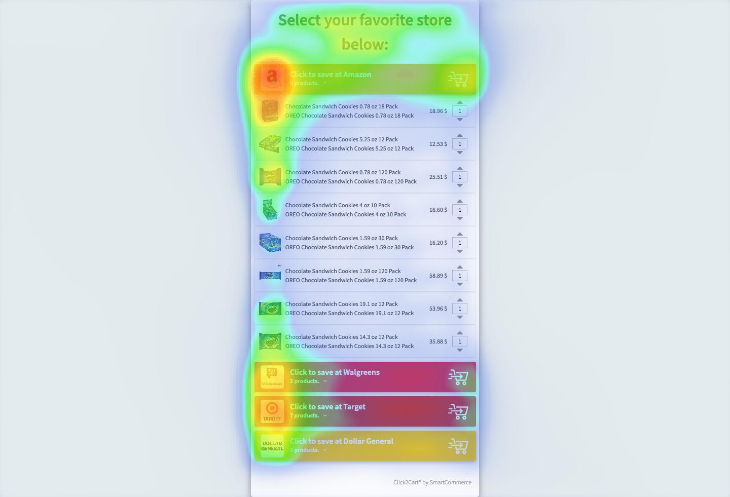
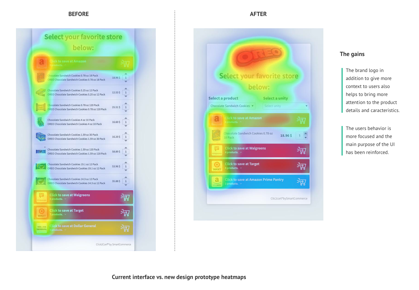
After organizing the data by clusters I could identify some patterns in the pain points of the product experience. In order to confirm those findings, I backed them up by running a metric analysis, with Hotjar. I configured for some of our clients using the same widgets, various heatmaps that confirmed the first data I had on the user's behavior.
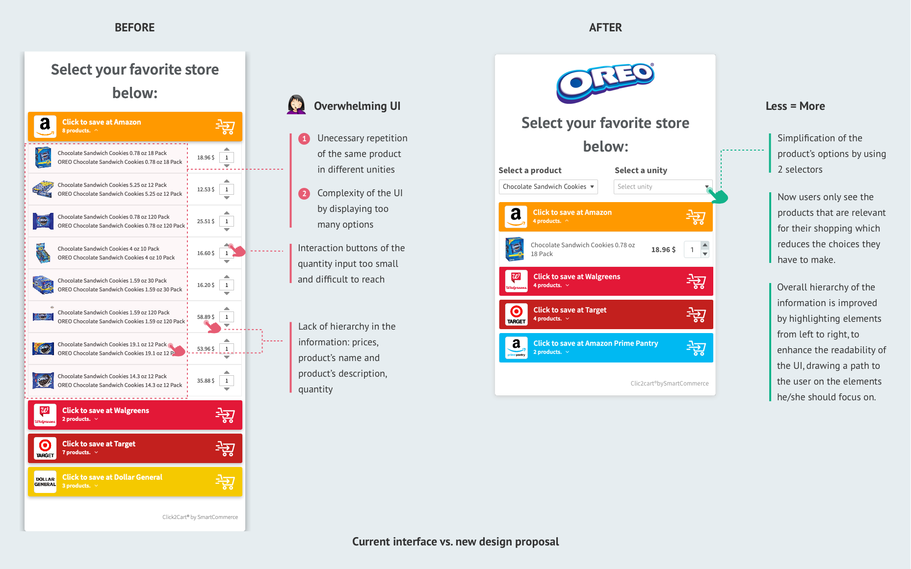
#1: Missing opportunity in the main feature
The actual UIs of our product don’t cover the brands’ need when they want to promote a product sold by different unity, size or kind of pack declinations.
#2: Overwhelming UI
If a product has a lot of variations, the display of all its declination feels repetitive and offers the user too many items to take into consideration, which cancel the purpose of this UI. It creates a page that require the user to scroll which could lead to frustration or losing the buyer interest. It also increases the time it takes to customers to make a decision, which tend to be a barrier in the purchase process.
#3: Lack of connection with a brand
As the campaigns are mainly aimed to be displayed on socials, the connection with the brand has to be strong and clear which is not the case with the current product.
Journey Map
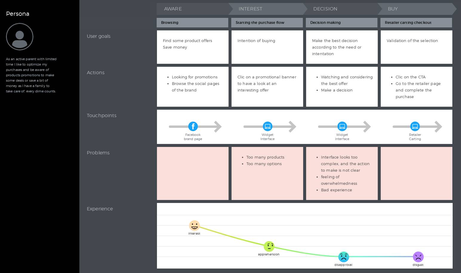
I made a quick map of the main steps performed by our customers, in order to capture the key interactions of the end users with our product and focus on their motivations.
Mapping a design scenario also helped me to increase my knowledge of our customer users' journey and organize the data collected from the research phase.
User story
As I presented the findings of the research phase to other departments involved in this project, in order to sum up and synthetize the information, we wrote a user story, to maintain the focus on our goals for this project:
“As a recognized brand, I want to generate my own landing pages so I can take control of the management of my campaigns, reach more potential shoppers and increase my sellings by displaying a simple selection of relevant offers to my customers.”
Ideation & prototyping
Wireframes
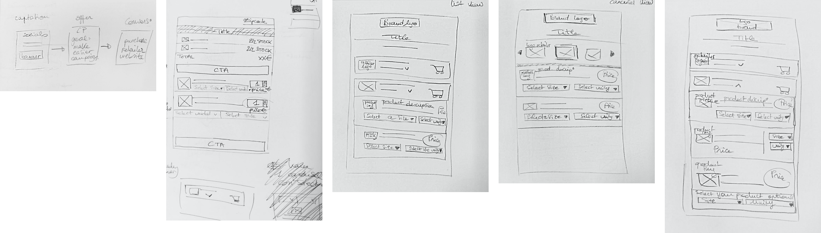
I started to draw the skeleton of the screen interface on paper, in order to have a first idea of how to integrate the new features and their technical requirements. It is also a very convenient because it allows to iterate quickly, before worrying about any visual aesthetics aspects of the product.
First testings
After a first round of testings on my team members, I realized that the first prototypes that I've made were still missing simplicity, from the way they interacted with the widget. So I get back to the ideation part and came up with another design proposal thanks to the collaboration of the developpers working also on that product.
UI Design
As it is the continuation of an already existing product, I used the already existing style guides that I previously created for this product, that reduced considerably the time I needed to come up with the high-fidelity prototype.
Testings and Take aways
As we launched the new UI, I kept paying attention on the heatmaps of the product so I could mesure the impact of the new feature's design.
The overall results were encouraging as we could already notice enhacement in the way users interacted with the new interface.
Learnings
The role of the User experience designer is really at the core of a company activity. That's why a collaborative approach can only empower the design process and help reduce mistakes in an early stage of a product developpement.