About the project
A client whose business is renting flats in Barcelona reached out to a colleague of mine - a designer - to redesign his website. I was asked to collaborate with her, and we decided instead of approaching the redesign in a old fashioned way, to focus on people expectations when they are booking on his accommodation platform.
In order to serve our client's challenges and business purposes we decided to run this project with a user centered approach.
Research
Observation
We started to prepare our first client’s meeting by making a website audit, looking at ways to improve it. As we knew that the person hiring us was feeling a lot of pressure to increase the conversion rate of bookings, the analysis of his website allowed us to present to him our strategy and how we would try to meet his expectations.
Guiding Questions:
- ¿Según usted cuál es su valor respecto a la competencia? (According to you, what makes your business more valuable regarding the competition?)
- ¿Qué es lo que tiene la competencia y que le gustaría tener? (What does the competition have and what would you like to have?)
- ¿Cuál es su próximo reto? Por qué? (What is your next challenge? Why?)
- Cuál es el mayor problema de su web según usted? (What is the biggest problem of your website according to you?)
- Descríbenos su/sus usuario(s)... (Could you describe us your typical user(s)?)
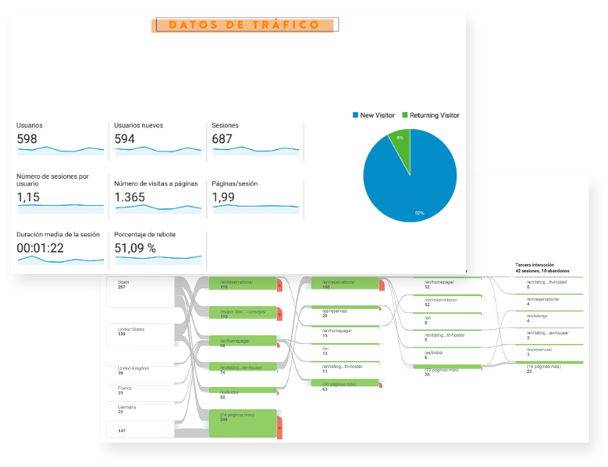
Collecting metrics
We had to work with tight time and budget constraint set by our client, so we couldn’t use a qualitative approach. We decided instead to observe user’s behavior through statistics by installing Google Analytics and Hotjar on our client’s website. After collecting the metrics from funnels, reports and session recordings we made three particular breakthroughs.
The analysis revealed that:
- Users were not staying long enough on the website to complete a booking task (the ratio page/session really low).
- The main user speaks English but most of the visits comes from Spain.
- The majority of the traffic comes from the blog articles in the website.
Many other insights also appeared through the metric analysis but we decided to focus on those three particularly, because we thought that they were the ones related to the main pain points for the users.
Define
The problem
Our understanding of those statistics resulted in our key assumptions. The users were visiting and using the website mainly for the quality of its blog content, more like a digital guide. The problem was that there were not enough direct bookings from our client’s website.
Challenges
We noticed that the booking platform used on our client’s website was not user friendly, this thought was backedup by the user’s behaviour analysis we had previously run. But as our client couldn’t change the system for business and technical reasons this became our biggest challenge.
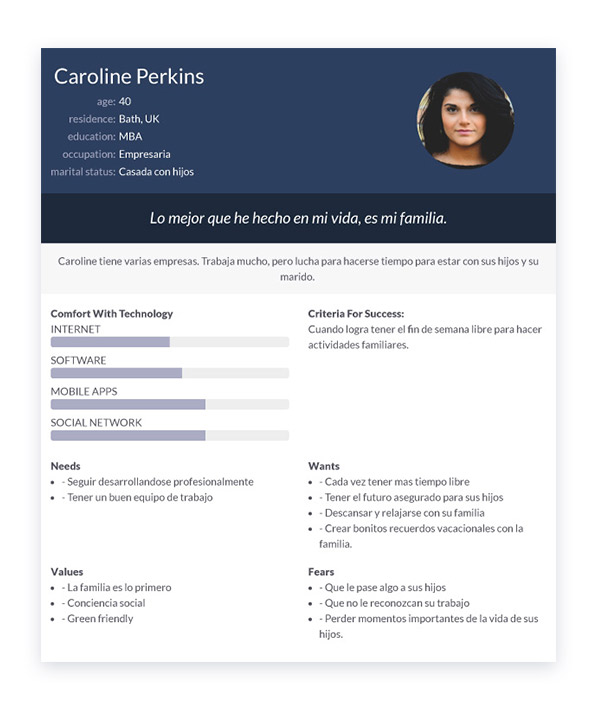
Enlightening the design with empathy
Based on our user research we profiled two kinds of Personas. Each of them had a scenario that identified a realistic goal the user might have when browsing the website.
- The information about each Persona focused on their goals, frustrations, expectations and motivations when interacting with the product, which was important to keep in mind throughout the project as it would directly affect our design decisions.
- As we didn’t have direct contact with the users we also felt the need to keep cultivating the sensitivity we'd gained so we put our insights into a customer journey map. This helped us to build a full overview of the user experience and of their relationship with the website.
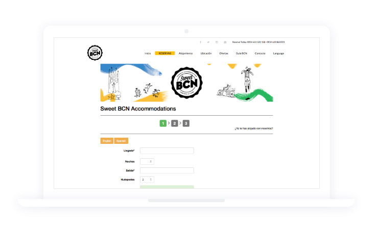
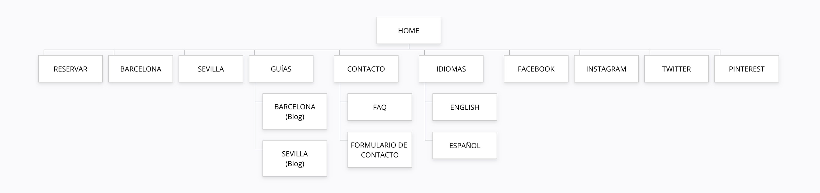
User Flow & Sitemap
In order to facilitate user navigation as much as possible and to improve the conversion rate of booking funnels, we decided to focus on the steps preceding the booking task.
Design exploration
Ideating solution
Prototyping
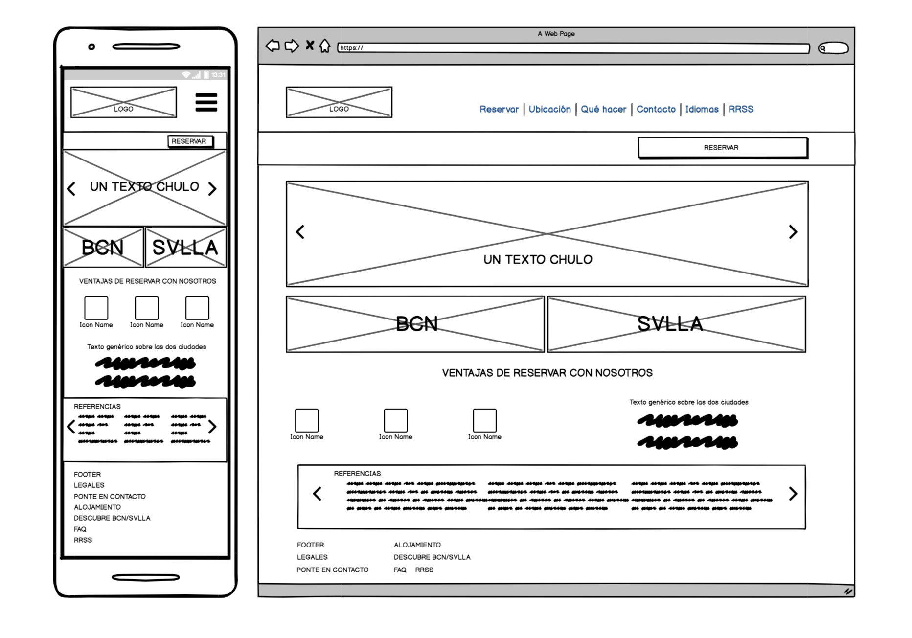
We first grabbed a pen and started to put on paper all our thoughts and ideas from our insights by rough sketching.
Once the design concepts began to take shape we translated them into mid-fidelity wireframes built with Balsamiq so we could iterate and revise them quickly. We tested our prototypes in-person and remotely.
Findings:
- Users wanted the ability to quickly see all the options existing for an accommodation in each city.
- Users didn’t understand where the “location” link in the menu was leading them.
- Users felt that they was too much information in the detail of the accommodation page.
Design solutions:
- A separate page for Barcelona/Sevilla with a listing of all the options of accommodation for each city.
- New labels in the menu: instead of location we created two links: “Barcelona” and “Sevilla” to split clearly the content related to the cities.
- To fix a number of facilities icons for an accommodation and a size for major texts and use dropdown to hide all the additional information.
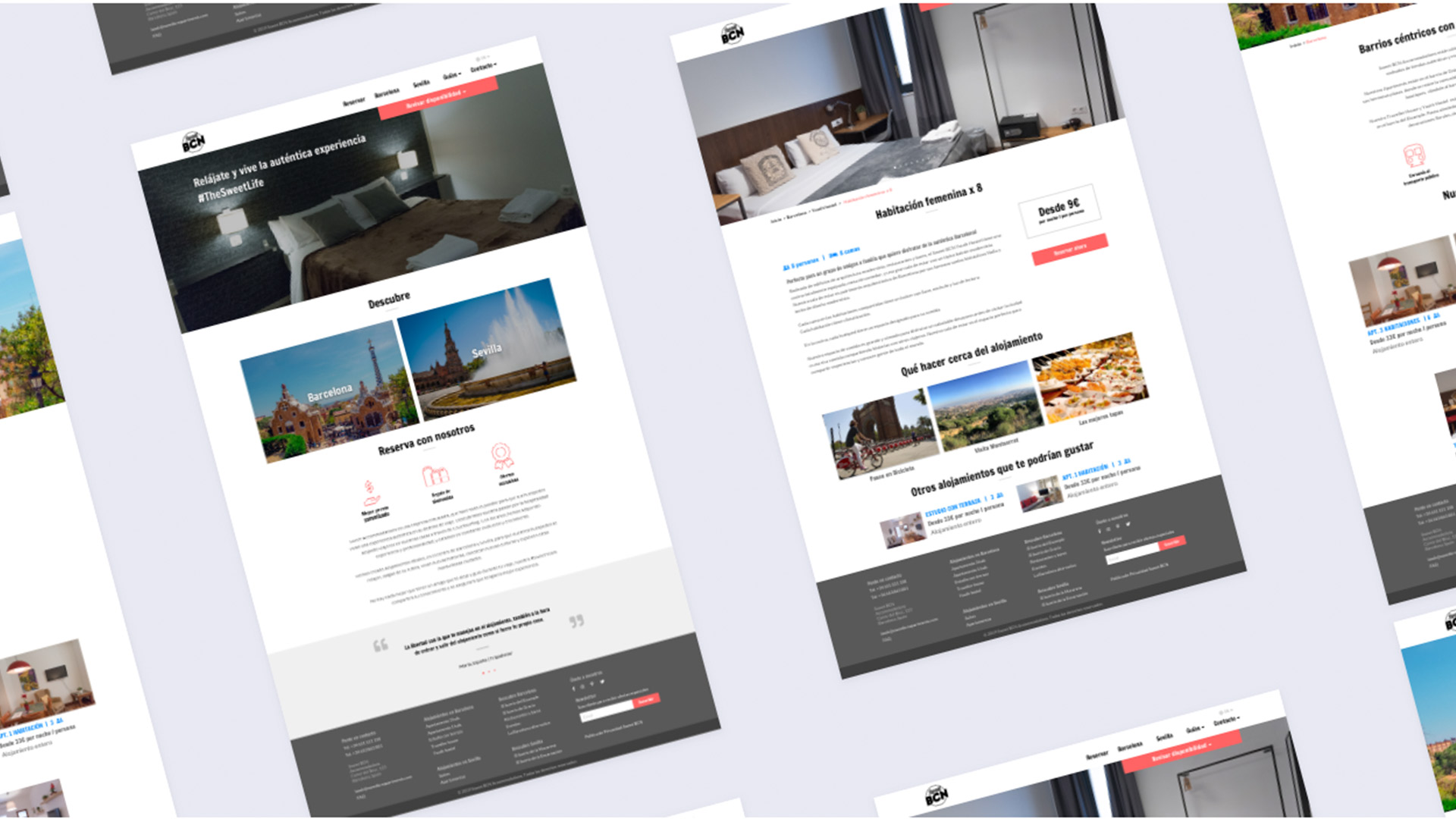
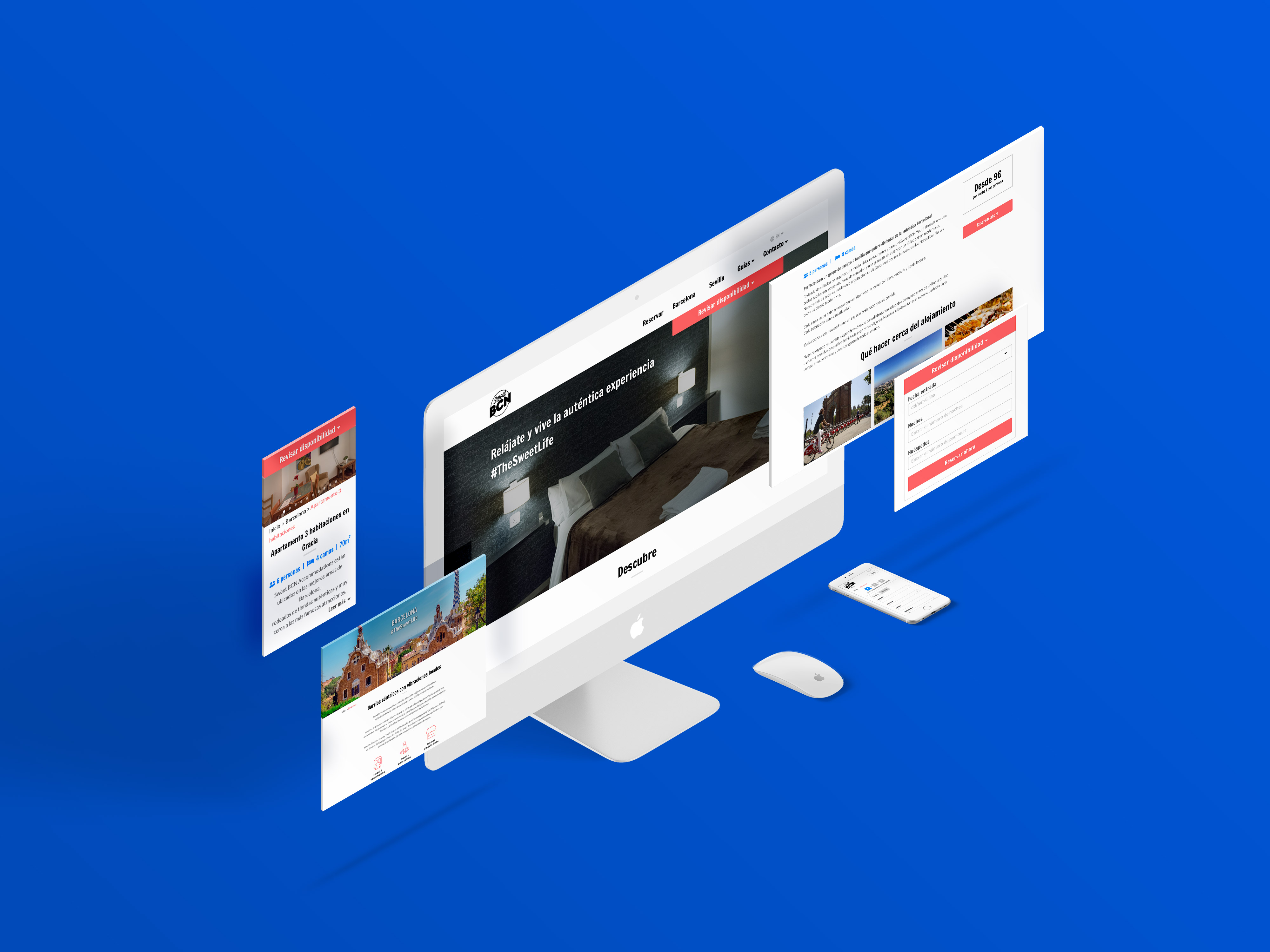
Visual Design
After the first round of usability testing, we started to design Hi-fi mockups in Sketch. Our goal was a clean, delightful and modern look that would help users fulfil their goals quickly.
We created a style guide to establish consistency between us, and checked in consistently on each others’ work to make sure the visual language was uniform.
Then, with another round of usability testing that validated our direction, and after some minor tweaks, we were ready for showing the results to our client, and let him start with the next steps of the project.
Learnings
We thought that collecting insights from metric tools during the research process would be time saving. It is indeed quicker than coordinating interviews and analyzing the transcriptions to highlight the insights.
But in the end I think we have spent exactly the same amount of time by trying to understand, guess and confirm the "how" of a special behavior we observed in the statistics.
That’s why I think for this project that it would have been more efficient and could have saved a lot of time working with a combination of the qualitative and quantitative approach, because the two methods are really complementary.
But even though we made a few mistakes, I’m glad we made them because when we tackle a new project, we won't repeat the same mistakes again.