
Introduction
The goal of this project was to come up with an app that allows users to optimize their time, by giving them information in real time about delays in public services or the density of a place so they could avoid lengthy queues and manage their waiting time.
This project was realized in the context of an UX immersive course, but what you'll see is the result of what a team of 5 motivated designers, can accomplish in 8 weeks.
During those 8 weeks my role was multifaceted, as I participated at every stage of the design process, which gave me the opportuniy to learn more and practice every UX methodology we used to build this project.
The design process
Interviews
At the beginning, after a quick talk about our backgrounds, networking and family connexions we decided to focus on the health sector. So, after realizing a Mind Map we settled on a topic so we could start to set the questions for the the first draft of interviews.
We went to the street, asking for some volunteers to participate. Guided by the feedback we collected at the end of each week we started to identify a common PAIN which was the waste of time in public health structures, due to a large amount of people and delays in their daily schedules.

Exploration of the problem
After some 30 interviews we started to build our first Personas and Customer Journey. We also completed a Value Proposition Canva which allowed us to define our first hypothesis in order to think about a first solution for the problem we identified at this stage.
In order to come up with a quick solution, we started to sketch some paper prototypes and tested them with users.
The two rounds of prototype-feedback brought us two valuable insights:
- The PAIN we identified at the beginning wasn't only limited to the health environnement, but it was totally transferable to the private sector as well as to the public and the leisure.
- We realized that the solution we designed was technically limited, in terms of access to the public health data base.
Pivoting & Iterating
At this stage of the project we operated a 180º rotation and decided to focus on a solution that would help the user manage his time schedule. We needed to gave him a tool that would allow him to avoid crowded places and get visibility about delays, so he could decide wether or not he wants to go to a particular place.
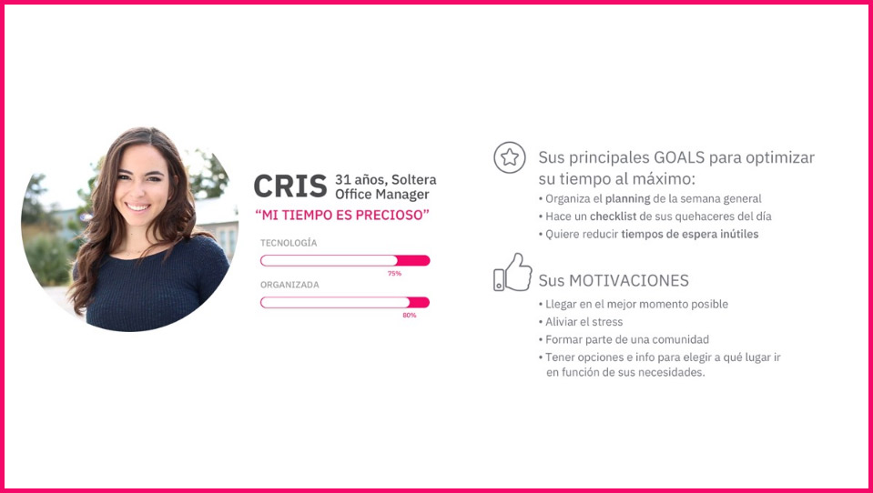
Personas
With all the information collected from the interviews, our observations and new hypothesis that we finally confirmed, we could build our final Persona that would help us represent the main needs, pains and behaviours of our users, in order to gain a better understanding and be able to empathize with them.
So, we realized that our persona is very busy and her main frustrations were:
- Being late
- Losing and wasting time
- Complications to her journeys
- Stress in crowded places
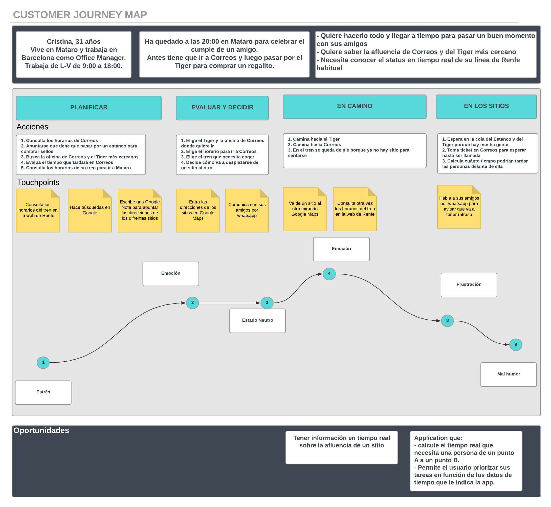
Customer Journey
In order to get to have a more complete understanding of our user's behaviours, we created a Customer Journey Map.
So we set a context and designed an whole process for our Persona with all the tasks and jobs she had to realize at every step of her journey.
We could identify the main touchpoints and her emotional state during this path, so we were able to figure out at what stage her most important painpoints were, and could see opportunities to relieve her frustrations.
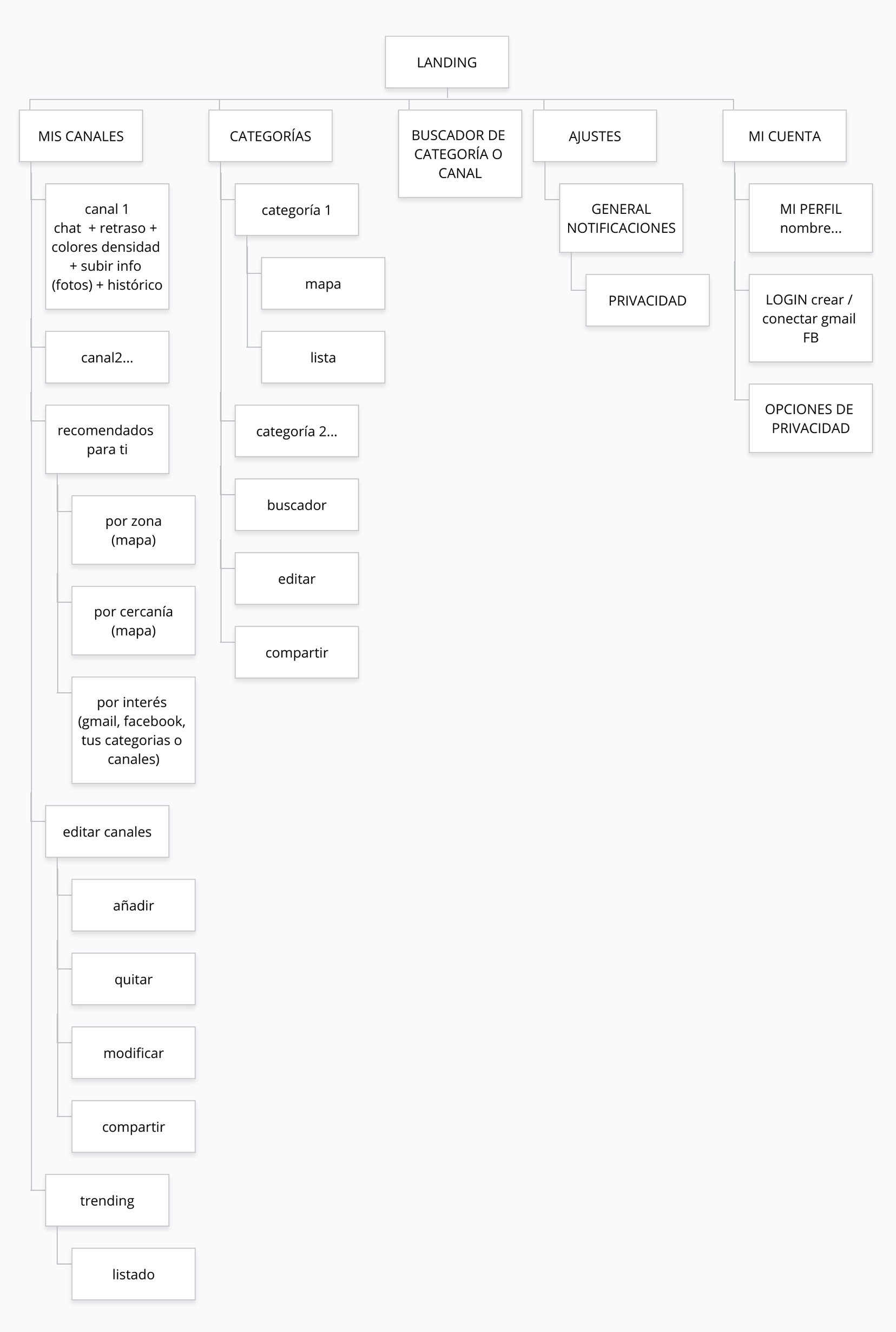
Building the sitemap and user flow
To give ourselves a comprehensive overview of how our users might navigate through the website, we created a site map and a user flow.
The main goal of this was to gain a better understanding of the functionalities, and to design the foundations of the experience that our application would provide to the users.
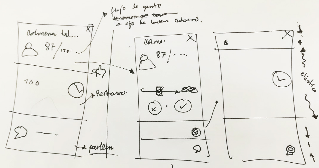
Sketches
To confirm our hypothesis and evaluate the interest of our potential users, we started the design process with low fidelity sketches, so we could test and iterate through many design options quickly.
We repeated this process 4 times, bringing changes at the end of every testing round.
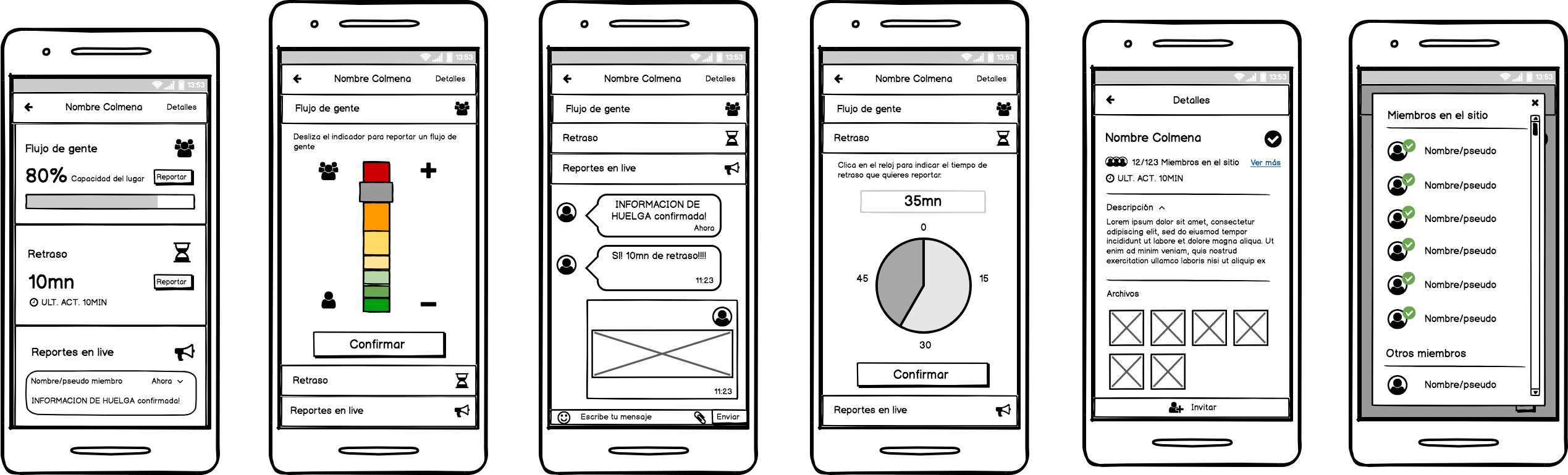
Wireframes
After the sketching we created - with Balsamiq - medium fidelity wireframes for more precise testing purposes. We decided to design the login page and all the main features of the application to show a complete user flow.
Thanks to the wireframes we could identify at an early stage any inconsistency in the content and also validate the user flow and his understanding of the product.
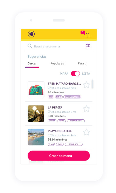
Our solution
Beesy is an application that gives you real time information about the people density in a place, service delays or complications on your path so you can avoid queues and manage your waiting time.
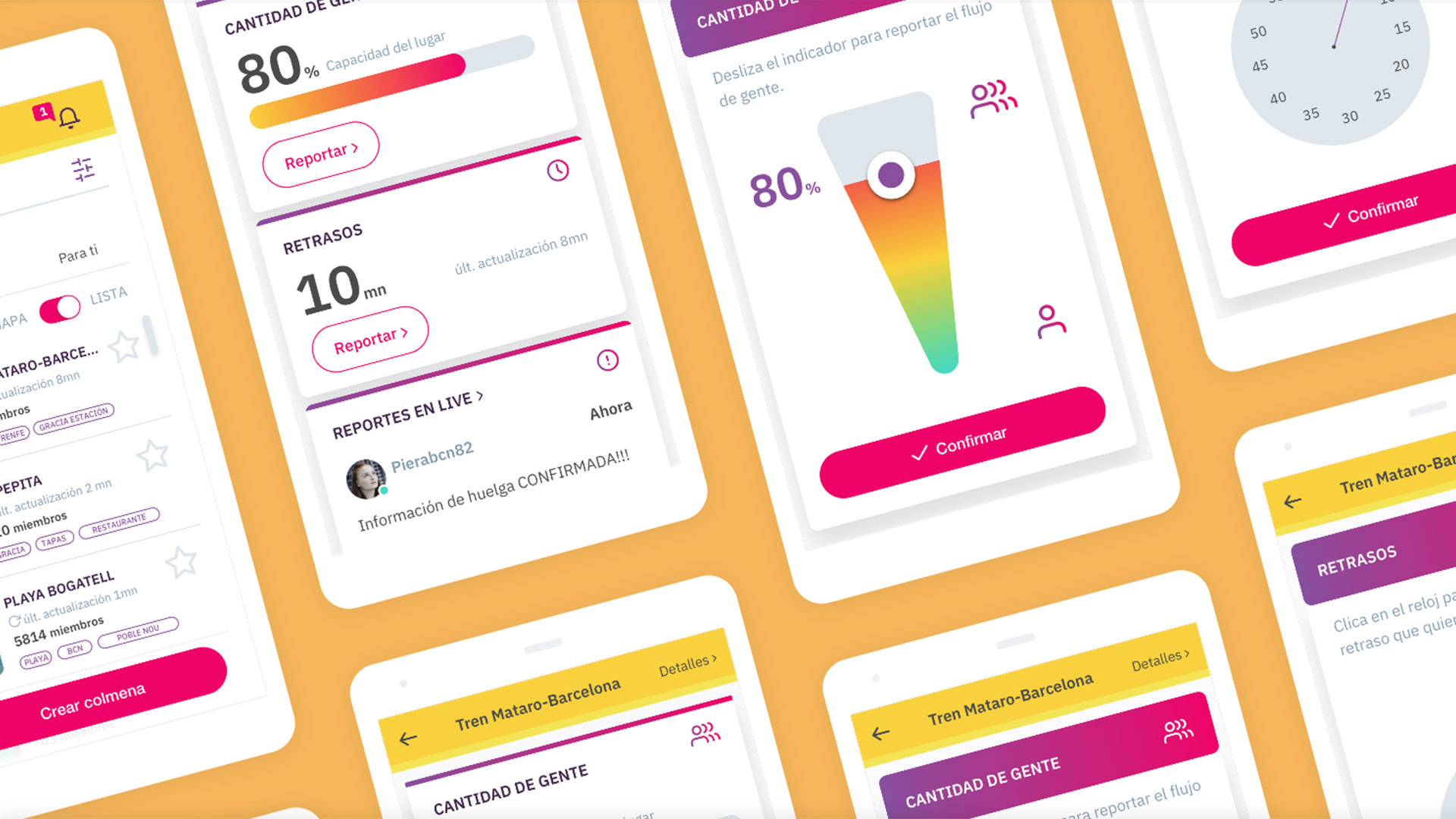
UI Design
Our goal was to design a dynamic and entertaining app that would help our users.
We used a style guide and a design system in order to maintain consistency between all of us, and managed to build a uniform visual language by using Abstract.
What have I learned from this project?
What I have learned from this project is that fears, problems, and struggles are always going to be a part of the design process, but it's a part of the learning process. So fail as fast as you can and iterate to come up with a new solution and get onto the next step.
Check this video out to know more about this project.