In the context of the global crisis due to the Coronavirus pandemic, UXER SCHOOL called on the global design community to turn that situation into an opportunity to creatively resolve all the challenges related to the virus.
As I was wondering how could I help as a designer, I saw this initiative as a wonderful opportunity to try to bring some helpful solutions and contribute to the situation by applying human centered and design thinking methodologies.
From my own experience of the situation and the observation of the people of my environment, I particularly witnessed the emotional weight of the quarantine. As I was especially receptive to this issue, I decided to focus on the health sector and joined a team that wanted to focus on the problematic of bringing psychological assistance for people experiencing difficulties when dealing with their emotions.
For this project I had the chance to work with a team of two psychologists: Gabriela Ramírez, behavioral psychologist from Mexico, Eduardo Lantigua, clinical psychologist from Dominican Republic and Unai Aberasturi UX-UI designer from Spain. As for me, I am a human-centered designer, and I took over the role of project’s manager for this challenge to build the solution that I am going to present below.
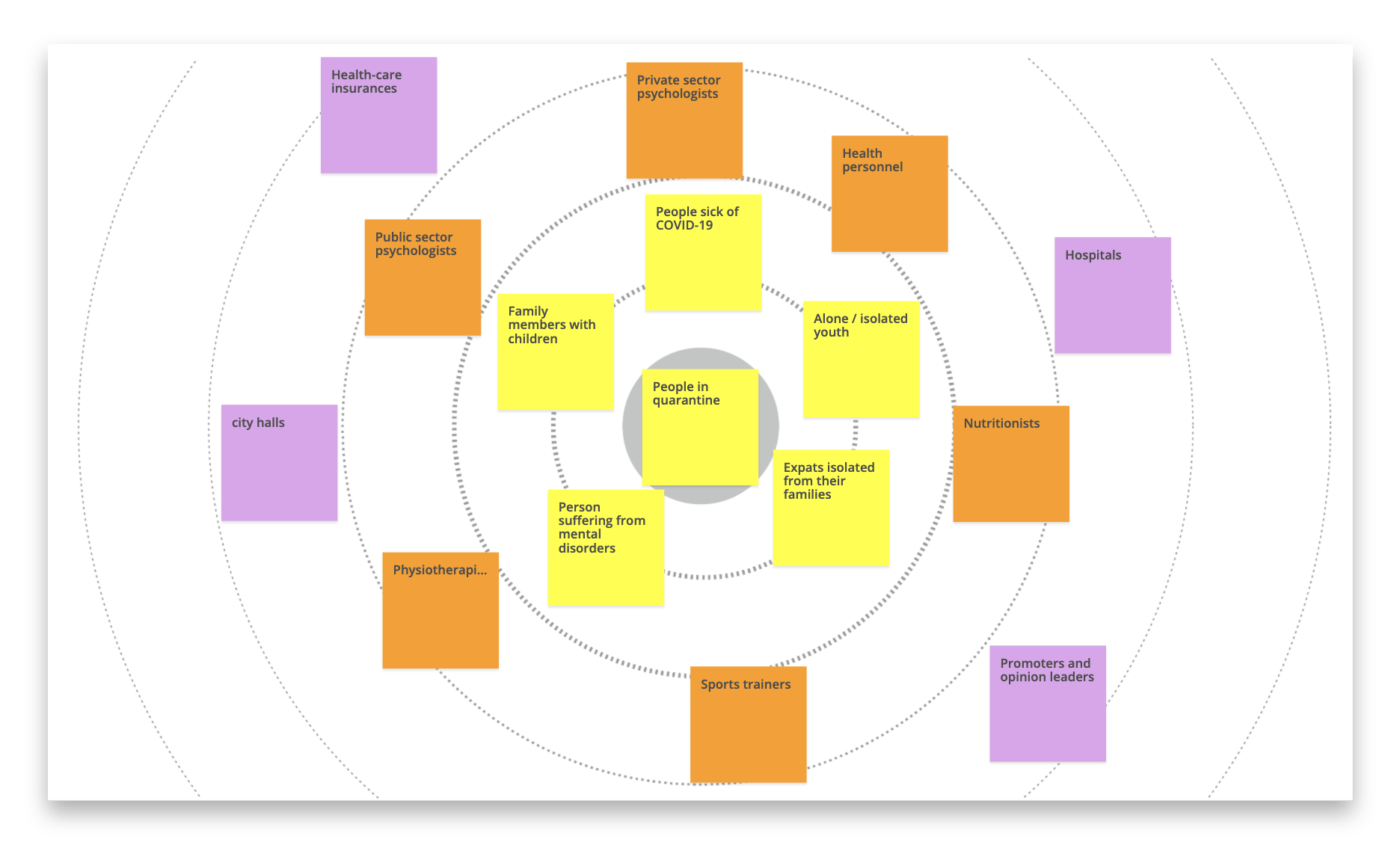
We started by writing down the people and groups that would be directly involved in or reached by our challenge, so we could spot the areas where we probably were lacking information.
Then we created a visual representation with a stakeholder map, in order to easily understand and define how to deal with each of the different roles previously identified.
Once we had our scope defined, in order to test our first hypothesis and gain insights about user behaviors, needs and motivations, we started to run interviews.
As we needed to speak with several psychologists and people in quarantine from different backgrounds and profiles, we set two scripts so we could adapt our questions to both profiles: the professionals and the direct target audience.
In order to help us define the needs, goals, and behavior patterns of our target audience we built an empathy map, that gave us the basis to realize our Persona model and Customer Journey.
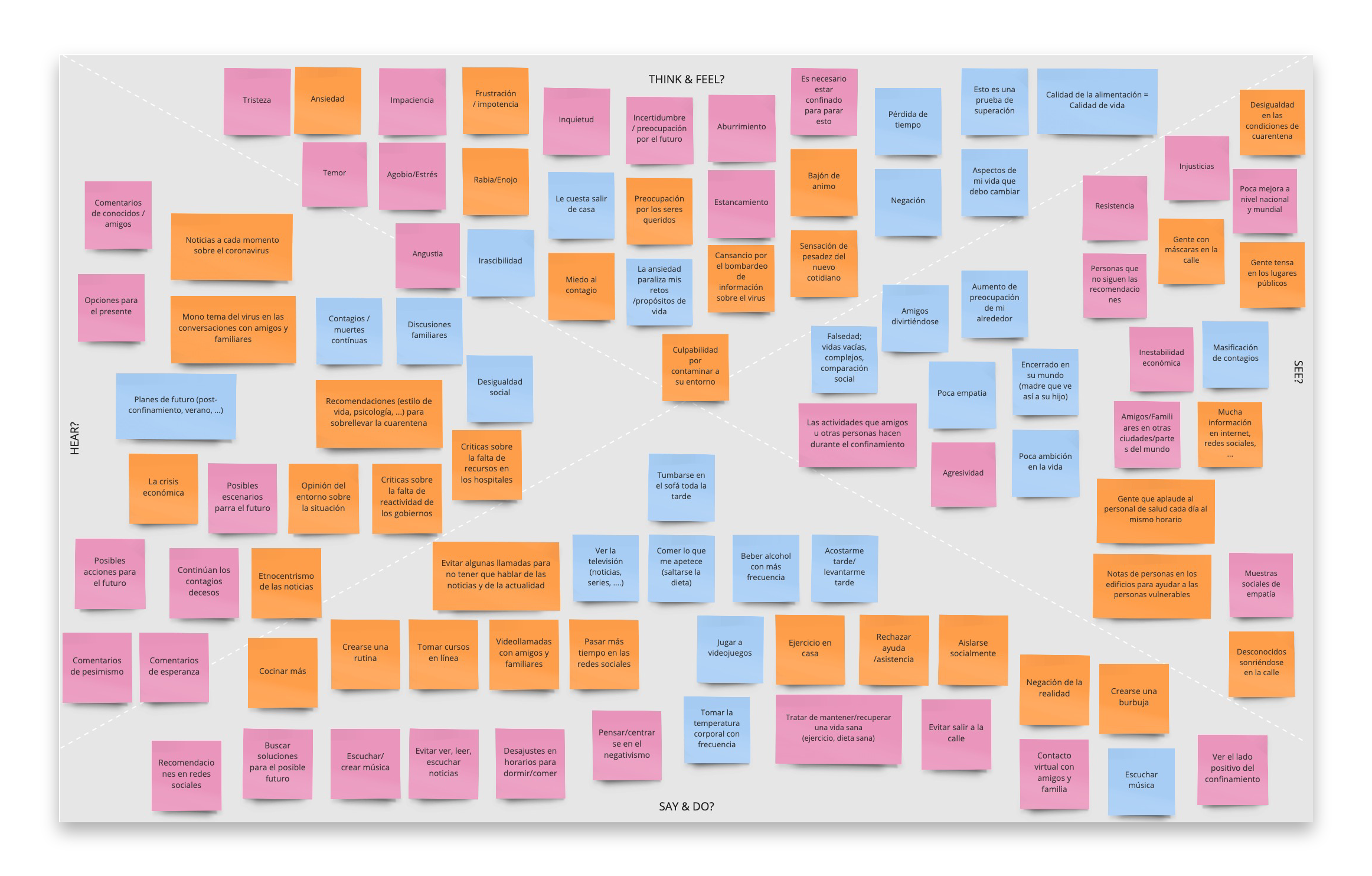
As we still had a lot of information to process from the interviews, we decided to organize our main insights into clusters and turned them into “How Might We questions”. This way, we were able to formulate our first assumptions to define our main problem statement.
How might we create a personalized space that inspires confidence so that people who need psychological help express themselves and learn to manage their emotions?
As we had our problem defined, we entered in the next phase of the design thinking process: the ideation. For that, we brainstormed and organized crazy 8 sessions that worked really well as we were able to come up with a variety of ideas for our future interface in a really short amount of time.
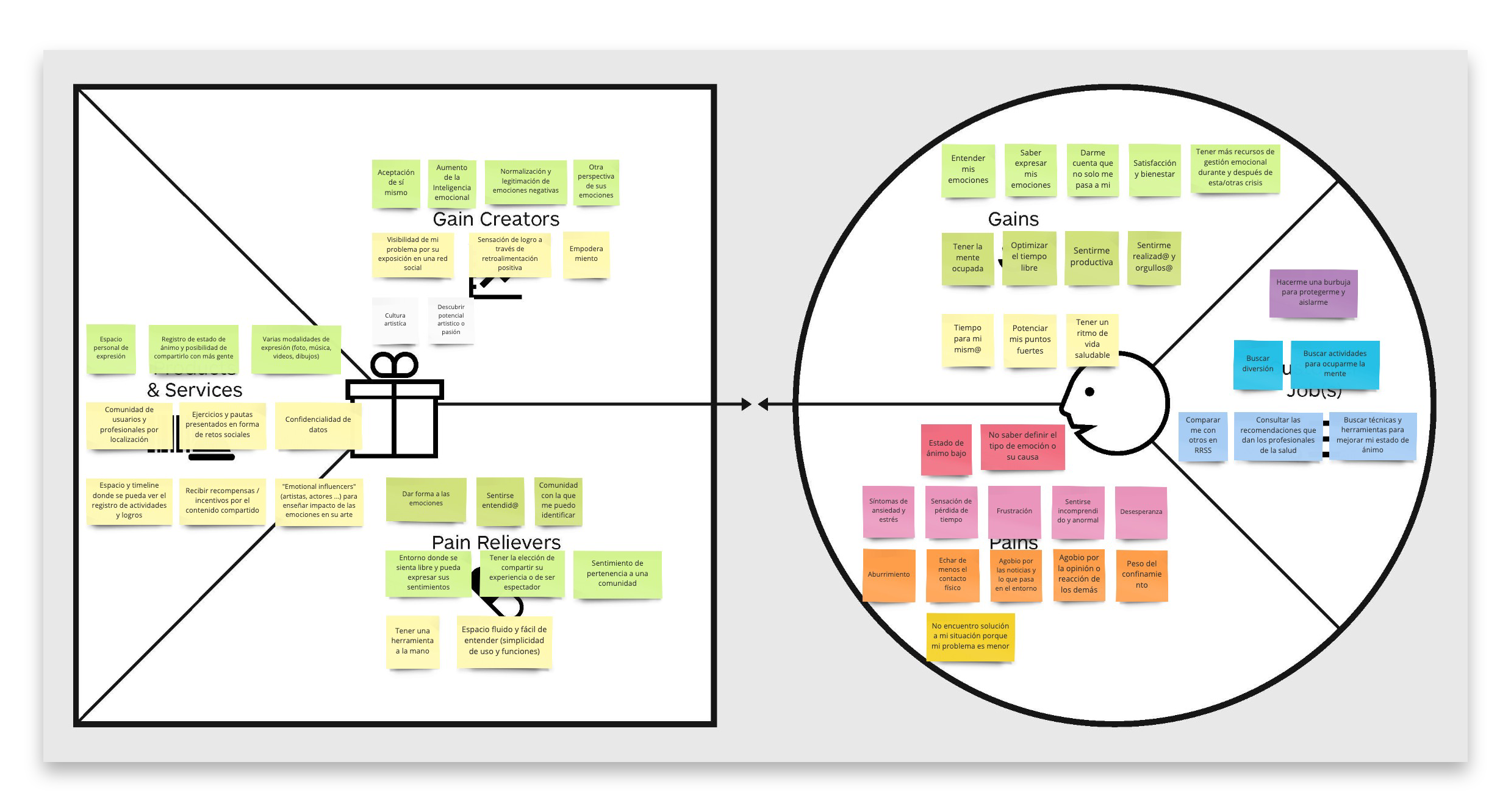
Once we had a lot of ideas, we used a value proposition canva in order to organize and prioritize them so we could start to verify that the value we were offering was fitting our target audience pains, gains, and be useful.
As we were clarifying our solution concept, we were then able to clearly identify our main competitors, and therefore decided to do a quick analysis of the existing solutions.
Unfortunately, we realized that some products had just appeared in the market, were already offering the same value, pain relievers and gain creators, as our concept.
So, we went back to our interviews’ insights and started to rethink our user’s problem. We realized that our problem statement was still valid, but that we had to focus our solution on a different angle in order to create value. So we decided to operate a 180º rotation by starting with a new core assumption which was:
People with low moods have a hard time seeking help in whatever form (talk to a friend, family member or professional).
This way we were able to offer a solution that would help not only the user with psychological needs but all kind of users to express themselves in an easier and more free way, instead of only offering them mental health assistance, as our competitors.
We started by writing down the people and groups that would be directly involved in or reached by our challenge, so we could spot the areas where we probably were lacking information.
Then we created a visual representation with a stakeholder map, in order to easily understand and define how to deal with each of the different roles previously identified.
Before creating any mockup of what the team had in mind, we first decided to test our value proposition with a survey in order to validate some of our hypothesis.
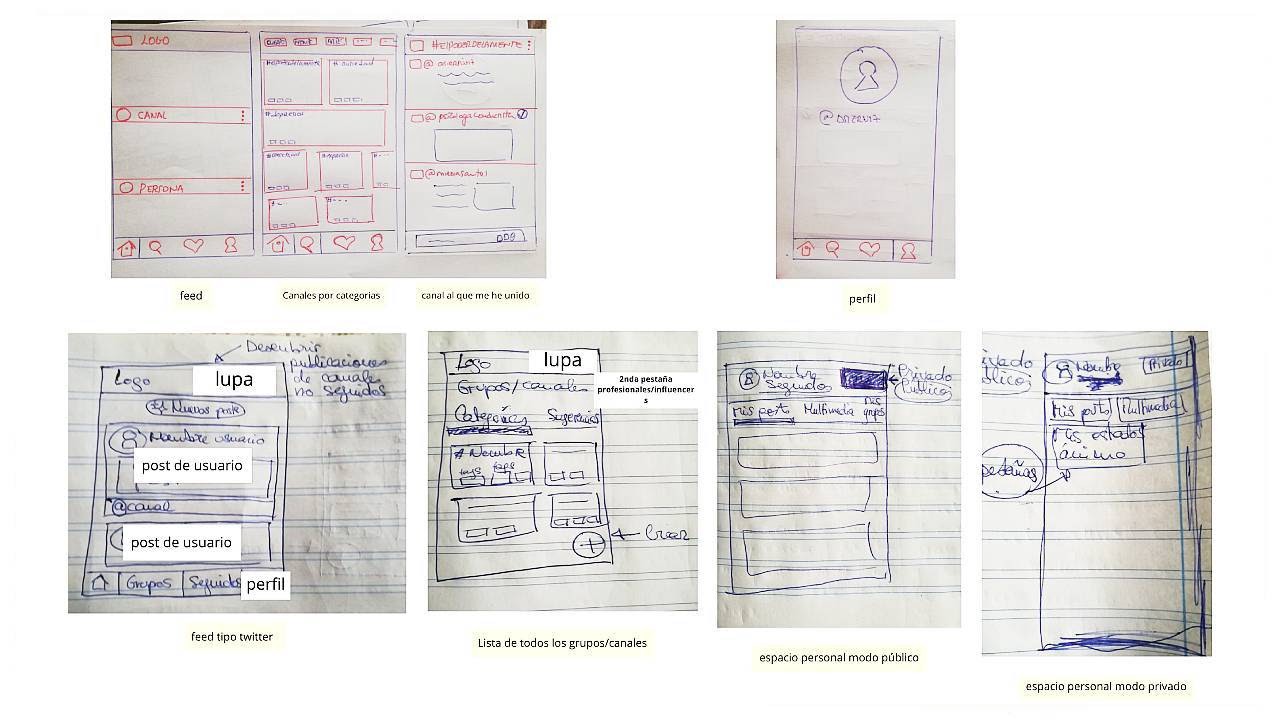
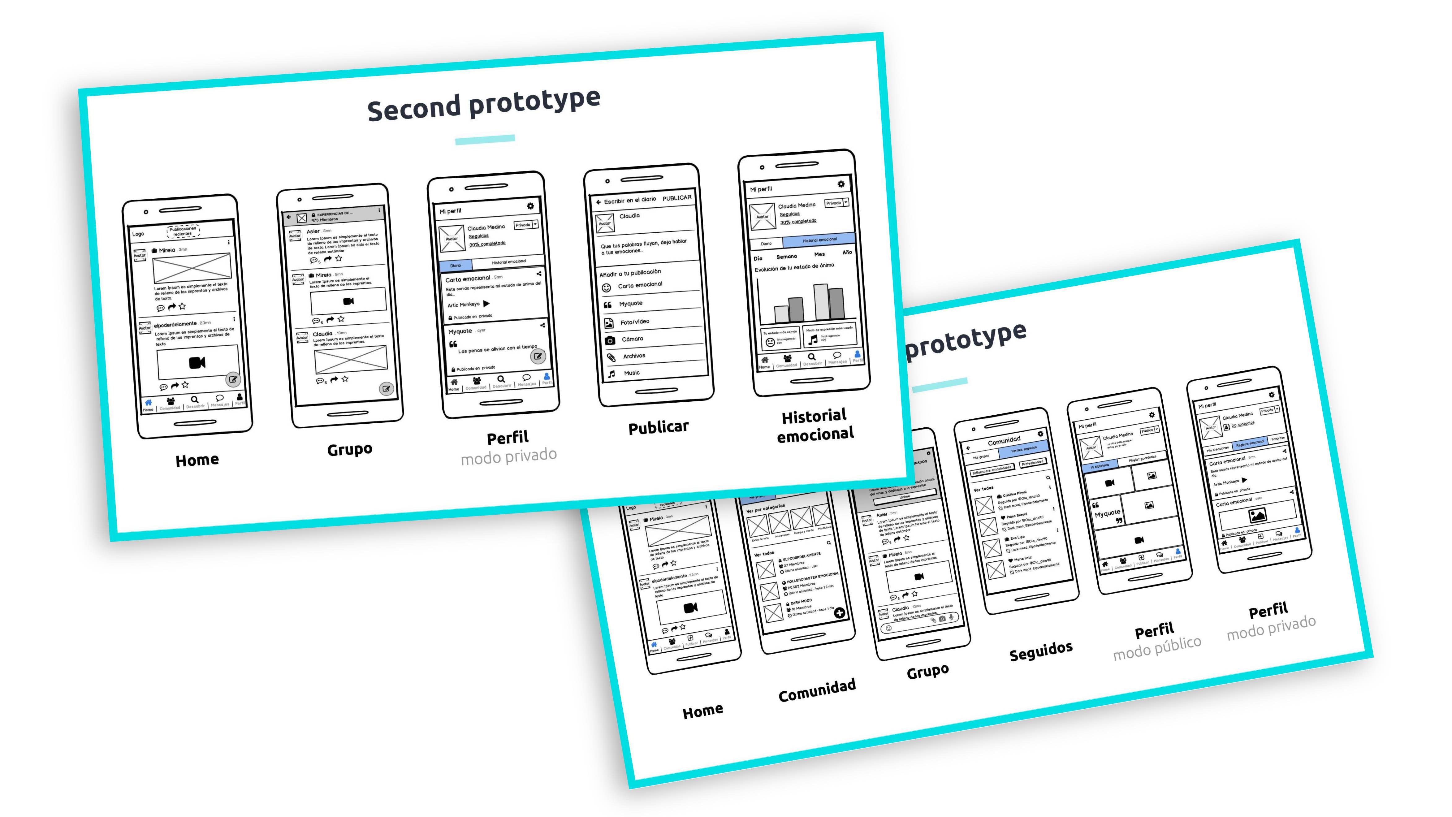
As those learnings helped us reduce some uncertainties, we started to rough sketch our ideas so we could quickly build a first low-Fi prototype with Balsamiq.
This first round of testings with real users highlighted really valuable insights. However, although our value proposition seemed validated, some problems in our navigation flow and profile screens appeared.
For instance, some of the main learnings that came out during the prototype’s interviews were:
We turned all these learnings into opportunities of improvement of our current prototypes, and used them to build new wireframes.
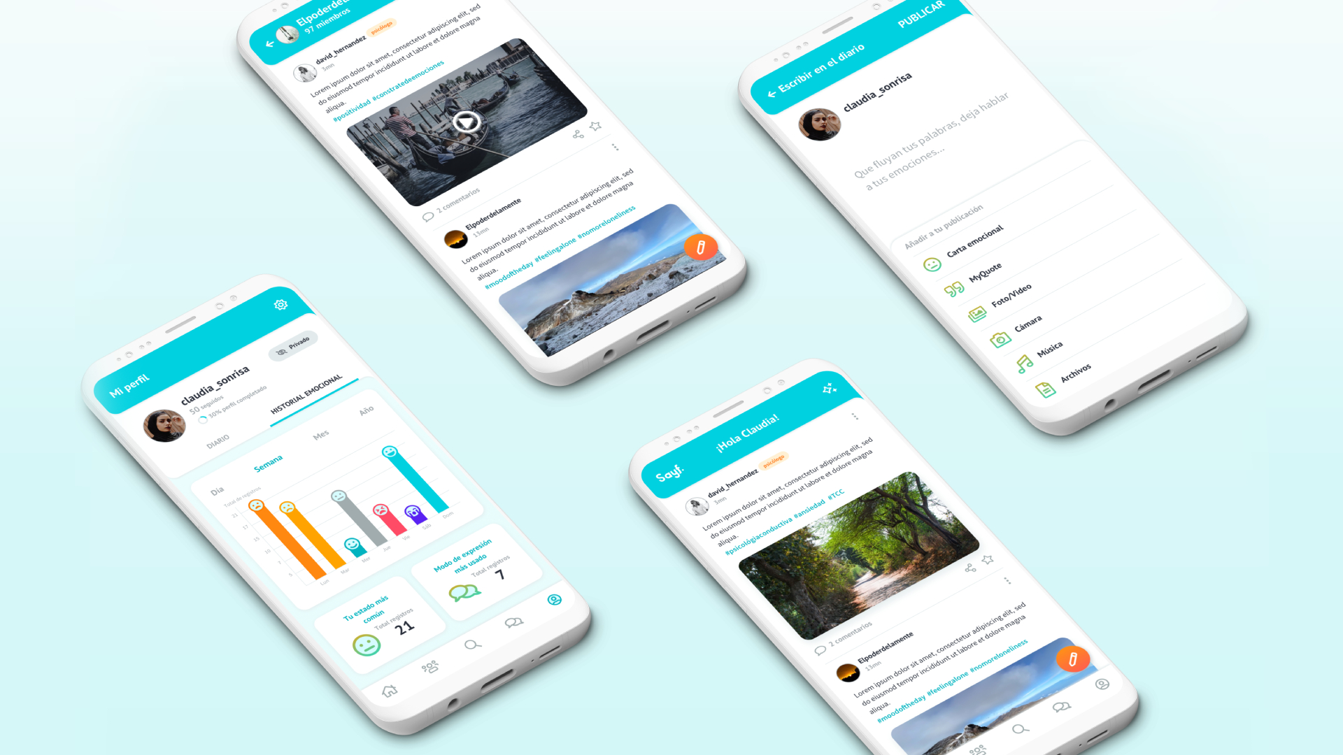
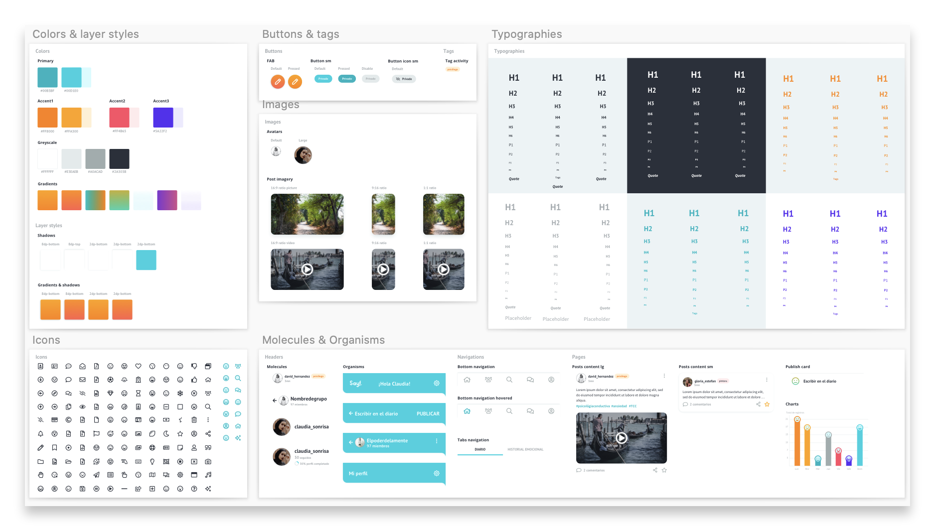
Our goal was to design an app that would inspire energy, safety, confidence and serenity to help our users. That’s why, based on color psychology principles, we used a palette of shades of orange and turquoise blue.
We built a Design system library in order to create a uniform visual language and then we let the magic happen using our skills on Sketch.
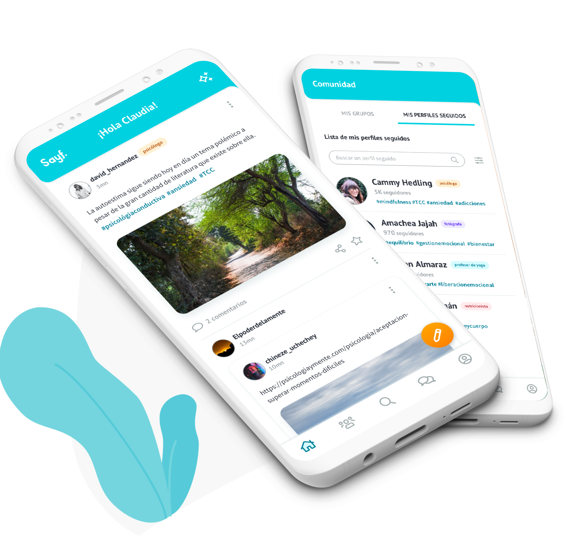
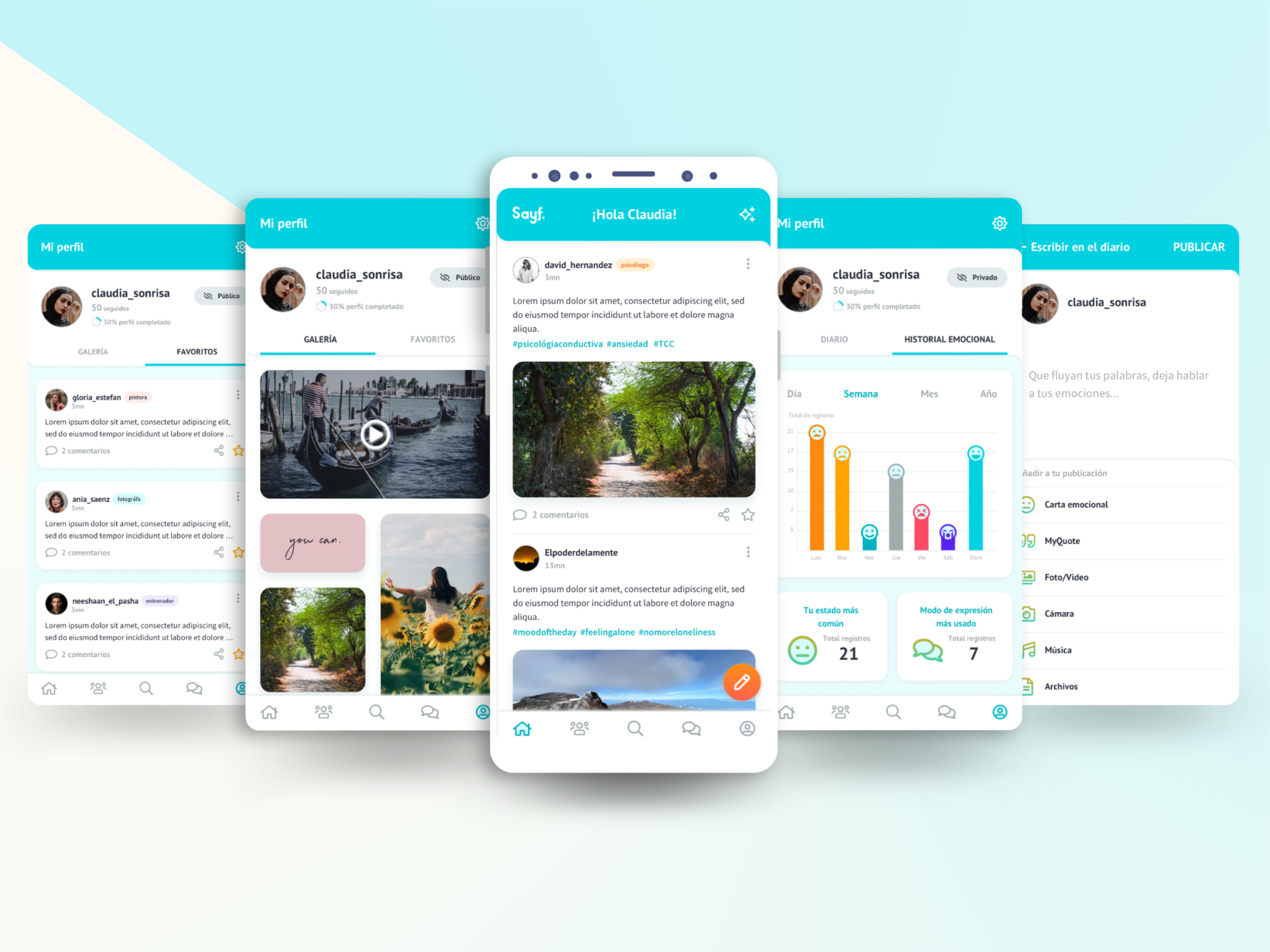
Sayf is an app that offers you a dedicated space to freely express your feelings, and where only you decide what to share and to keep private.
I cannot express enough how great was this experience. I had the chance to work with great people from different professional areas, to collaborate and share knowledges and resources with them and witness how we became during this project a dynamic and enthusiastic team.
It also has been a personal challenge as I learnt how to lead a team in remote from scratch with different time zones, schedules, and professional backgrounds, in the context of a global health crisis.
This experience, convinced me more than ever, of the importance of communication as a key of the UX process. My team and I, realized that if creating a coherent customer experience takes a lot of research and analysis, most of the work comes at the moment of sharing and communicating the information collected during every phase of the design process.
Finally, this challenge also highlighted that communication is not just a way to successfully facilitate your meetings, but it is also the ability to listen, to receive feedback, to have an open mind and to be able to put yourself in someone else’s shoes.
For the next steps of this project, we will need to do some testings of our Hi-Fi prototype with real users. Then the analysis of the insights collected will help us make all the necesary improvements to enhance the user's experience. And finally, if the team is on the same page, we might keep going with the app and try to launch it for real.
To be continue...